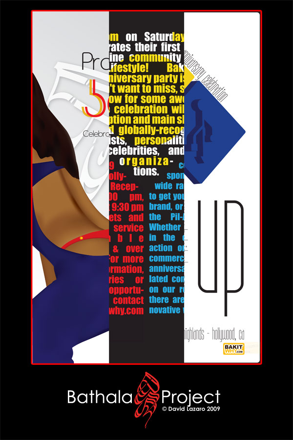
Finally, at long last, the project reveal: Baybayin in advertisement design, the Swerte Vodka Ad Campaign
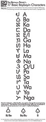
I've often wondered, if Baybayin were still used today, how would it look like? How would it be used? What kind of typographical or design rules would be coined throughout the years as Baybayin made its way into print media? The clearest comparison would be other Asian writing systems that are typically written either vertically or horizontally found in modern print. However, the curvature of the Baybayin characters are unique in its own right. This became the main question in this Ad campaign study; the use of Baybayin in modern print advertising.
I recently had the opportunity to speak with a former ad director who worked with Bebe clothing (OFFICIALLY pronounced as "BEE-BEE") and Skyy Vodka. It was the liquor campaigns which intrigued me, since I would see so many of them on billboards around the Hollywood club areas, and in the magazines of men lifestyle magazines. She told me her research process; figure out your key demographic, then talk to the waiters, waitresses, bar tenders, club owners, promoters, and ask them about what kind of drinks your demographic orders and why. So... I figured I'd appeal to somewhere around my alley: early 20's, heterosexual men and women, socially active, and love a good drink.
I was inspired by
a press video by
VuQo Vodka of the Philippines, where the representative said that the idea of introducing lambanog was to introduce something exotic, yet familiar, hence,
VuQo VODKA. So with this in mind, and after numerous talks with bar tenders, waiters, waitresses, it came down to the liquor that is pretty much 50/50 for men and women to purchase and consume: Vodka. I would call my Baybayin Vodka, "SWERTE", which means "Lucky" in both Spanish and Tagalog. I thought about how it would sound at the clubs and bars: "Let me get a Swerte on the rocks." "Swerte and sprite, please" "Pour that lady in the red dress a shot of Swerte... tell her it's from me."
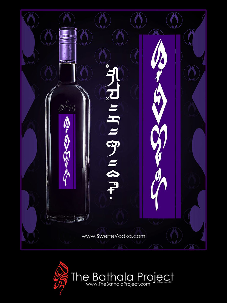
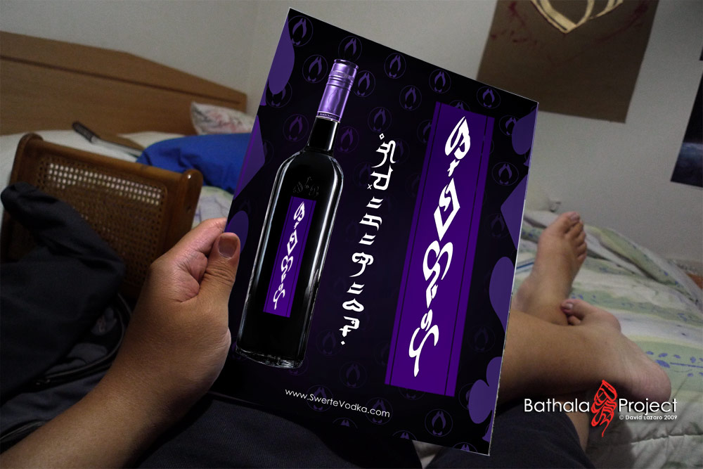
The first ad would thus be a product-driven ad. In America, typical product-driven ads for vodka have been a white background and the bottle, to exentuate the fact that vodka is clear. In Asia, typically it's a colored background, opposite of what the bottle color is as to highlight it. I wanted to go somewhere in the middle, so I chose a black background, also to give resonance to a night time drink. This ad would also serve as the main thesis of the corporate identity. The first thing you may immediately notice is the title for Swerte. Using the S, We, L, Te symbols, I styled them to mimic the shapes of the suits of cards, Spades, Diamonds, Hearts, and Clubs respectively. The background is tiled with the product logo, which is... a graphic representation of the components of copulation. Enough said. The tag line for the entire campaign is, "
Game ka na ba?" (Are you game?). The tag line in this ad is written down the middle in
Nordenx's Kufic font, and is the only ad using a font. The font suited perfectly for this ad, I just slimmed it down a bit. The narrow, sharp and square edges matched the title treatment for Swerte nicely. Along the sides of the ad I placed the images of the card suits, to give some graphic echoes to the character forms of the title treatment. Lastly, I arced the word "Vodka" (Bo-D-Ka) on top of Swerte on the bottle, in an effort to give some subliminal phallic imagery... So, with a graphic logo featuring copulation, and a title treatment featuring both phallic imagery and graphic parallels to gambling with cards, and a tag line implicating either sex or gambling luck, I was already forming the double meanings... Lastly,
THE WEBSITE IS NOT REAL, it doesn't exist. In Asian ads, even though their ads may have their national character writing on them, the websites are always printed in English, thus, SwerteVodka.com was born.
But don't bother typing it up... yet. Click for full size.
This ad would be a 1 page magazine ad, as shown in this mock up:
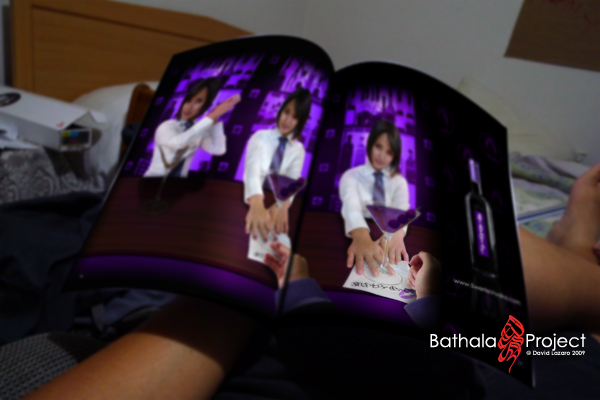
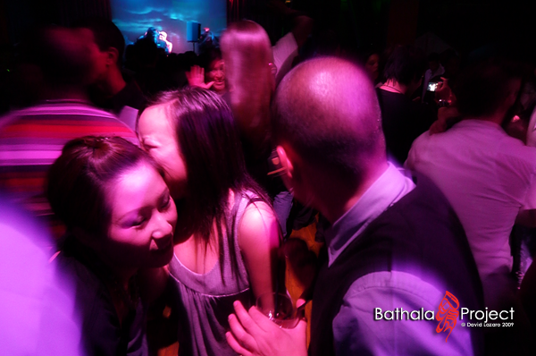
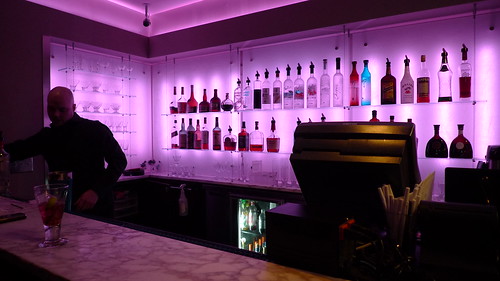
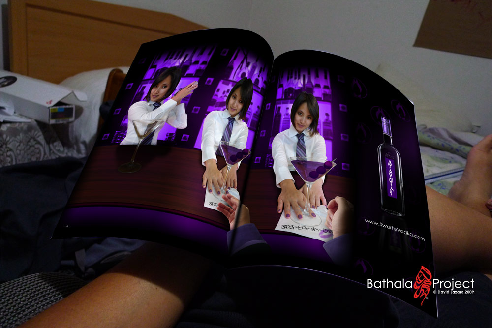
My main ad would be a 2-page magazine spread. Modeled by my mixologist cousin Libby (btw, photoshopping your cousin to look attractive; not awkward at all...), I wanted to give a visual echo of a
slot machine; so, the background bar wall was formed such that it would look like the 3 columns of a slot machine, and the bottle on the right would represent the lucky lever to pull on the slot machine. The bar tender is mixing a grape martini, which came as a result of my research; when I was talking to bartenders about what kind of drinks do people order in regards to flavored vodka, typically its either a special martini or some other mix drink; I'm trying to appeal to a more male crowd with this ad, so I thought a martini (and a male hand grabbing for it) would help represent this idea. The bar table is actually a brown rectangle with an overlay of a stock wood texture that I would perspective distort. The bar wall was originally red, and rather incomplete, as some of the bottles had to be reconstructed to make a full wall. In between the columns of the bar wall I placed the card suits again, to give more imagery of gambling and parallels to the
SWERTE vodka title. Everything was color matched to purple, to give that grape vibe, and also since purple/magenta hues gave much graphic resonance to night clubs. Whenever I go to a night club, the colors I always remember seeing are blue, green, yellow, purple, and pink... so to keep with the Swerte title visual continuity, purple. The bar tender model wasn't wearing any makeup what so ever, so this was a good learning experience as to how to apply make up. Thank goodness for the millions of girls on youtube posting videos of themselves putting on make up! Lastly, on the bar napkin is the tag line, "
Game ka na ba?". My hand writing ofcourse... Click for full size
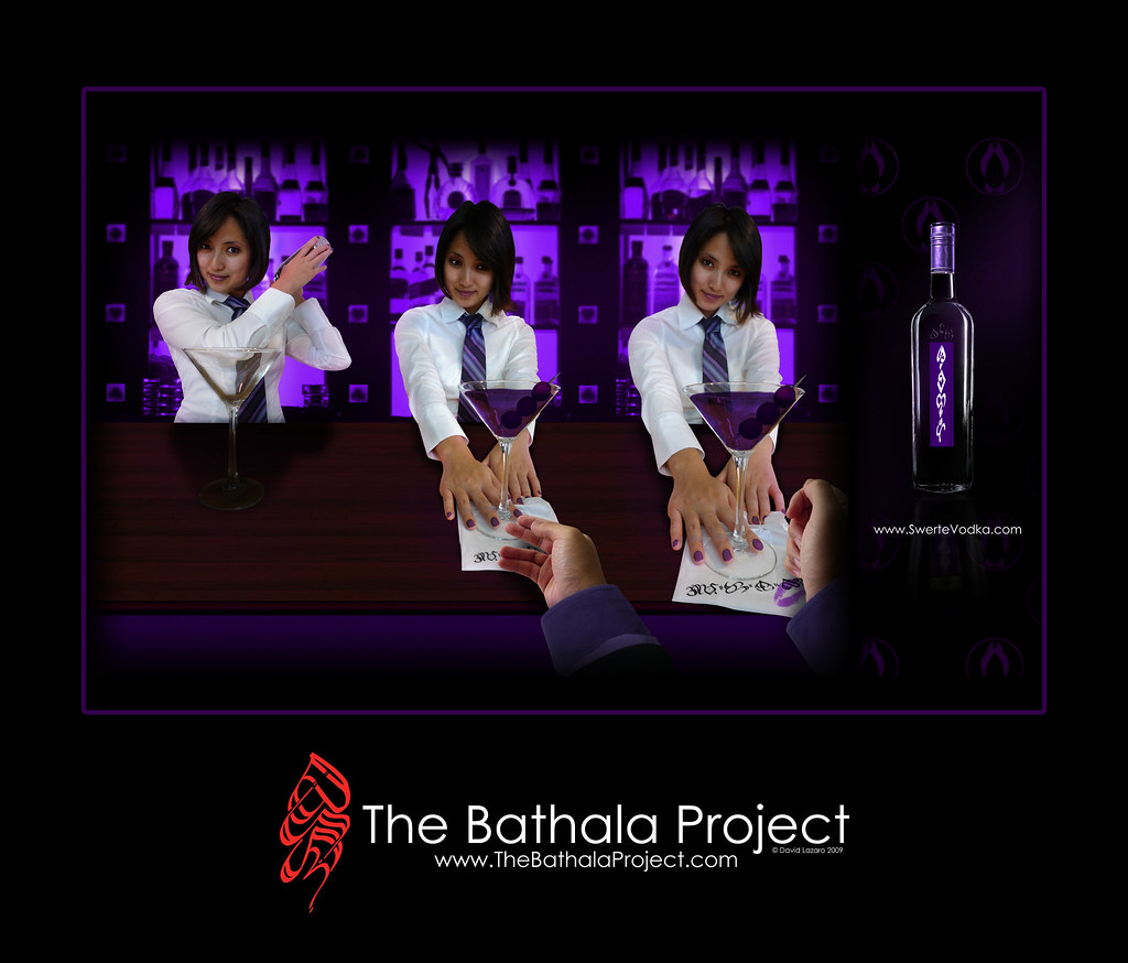
And the 2 page magazine ad mock up...
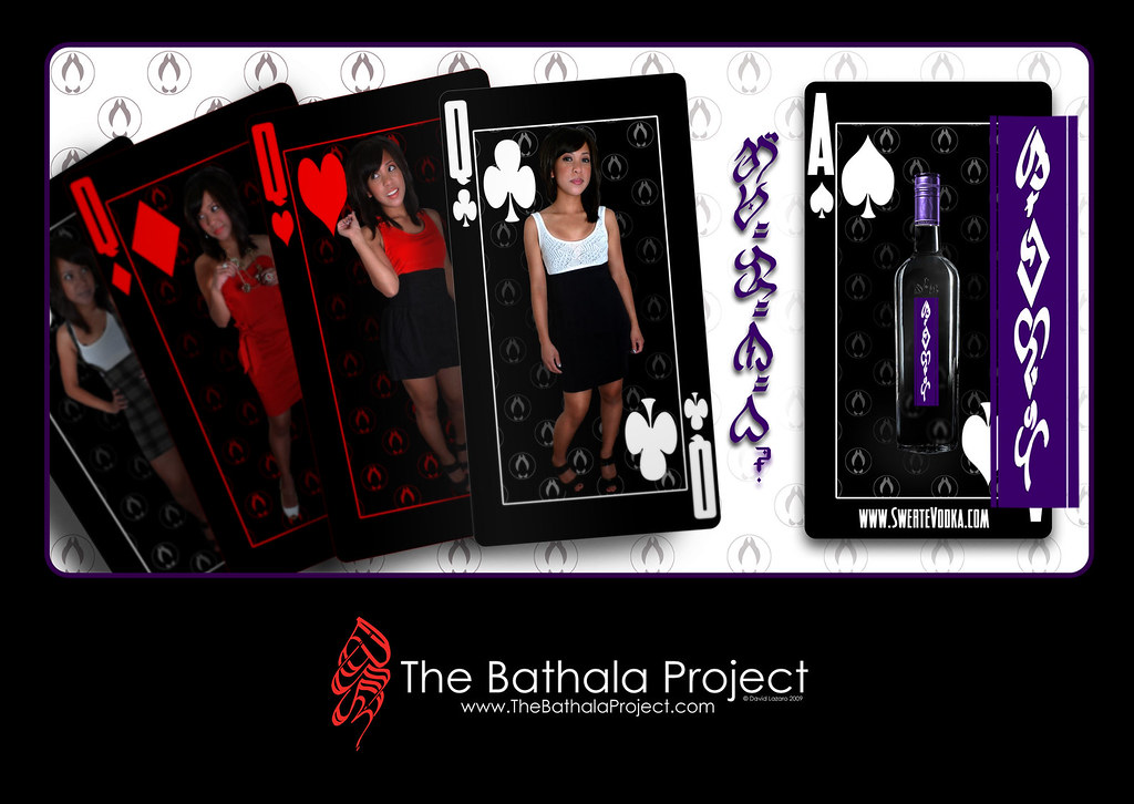
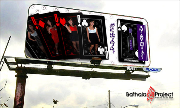
The final ad I was trying to go a more American route of the white background and product placement. However, I still wanted some fun imagery. After a late photosession (and multiple wardrobe changes later) I would get my queens; modeled by my friend Lani, I wanted to show a lucky hand, 4 queens and an ace. This was fun, as we wanted to keep as much visual continuity with the actual cards; so, the way their heads are turned are accurate in comparison to the actual face cards (except the clubs... kinda). And we gave personalities to the queens: The spades is young and playful, Diamonds is glamorous and haughty, Hearts is young and lively, and Clubs is the eldest, agressive and the leader of the queen sisters. And of course, Swerte Vodka as the Ace card. Spades was chosen for more of the phallic imagery. The typeface used for both the website and the card numbers is called "Detective". Most of the work in this piece was on the model; photo retouch, masking, make up... and hours later we get the lucky hand. Click for full size:
The billboard mock up over Los Angeles
This was a long, but very fun project. The research, the photo sessions, the brainstorming, sketching, endless hours of photoshopping... it was all a fantastic learning experience on layout, marketing, ad design and most importantly, modern Baybayin design. I'm looking forward to my next Baybayin ad campaign, to see how far Baybayin WOULD have come had it still been in print today. The only way to know is if we, the Baybayin writers, make it so.
Stay up,
~cyph

Baybayin in Design: The Swerte Ad Campaign