
Cyph's Mothaf*ckin Art Diary - My First Mural from cyphaflip on Vimeo.
Monday, December 22, 2008
Friday, December 19, 2008
Sunday, December 14, 2008


Thursday, December 4, 2008
Monday, December 1, 2008


Sunday, November 16, 2008


Tuesday, November 4, 2008
"KLeG" (Craig)


Saturday, October 25, 2008

Thursday, October 16, 2008
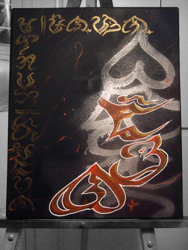
Permanent ink

Friday, September 26, 2008
DVD Review: Monaco Nights

Rappers have hood movies, Rockers have tour movies, Skaters have skate vids, Snowboarders have snowboard vids, and Graffiti Writers... have graff flicks.
When I watch a graff flick, I'm looking to see footage of live bombing (proliferation of one's moniker via marking or etching onto a well seen medium) specifically. I'm looking to see how they get to their spots, what kind of paint they use, their can control, their paint process (outline color first? fill-in color first?), how fast they paint, their handstyle... really, I'm looking to vicariously live through their actions, and watch and feel the raw sense of urgency, immediacy and accuracy.
With that said, Monaco Nights, a European Graffiti flick is... lacking. Very. What you can expect to see are videos of LOOKING AT (subway) trains with graffiti ON them already, via a shaky camera hand. Monaco Nights plays like this:
- 20 minutes of looking at bombed trains
- 5 minutes of painting on/in trains
- repeat.
However, the plus side: Though Monaco Nights really is a glorified graffiti SLIDE SHOW, you can expect to see great quality masterpieces at all times. Displaying a variety of European piecing styles, accompanied with a constant soundtrack of euro-electronica-fusion music, this DVD is pretty good for background music/visuals while you chill with your friends. I'd probably play this on the PS3 during a bbq kickback or while playing cards/Connect4 with the homies...
When it's all said and done, Monaco Nights delivers good visuals, shaky camera work, interesting bombing vids (though they are few and far in between), good constant soundtrack, and is perfect for those that LOVE LOVE LOVE LOOKING at train graff. But really, you could probably go to a railroad crossing and listen to your ipod and get the same effect.
5/10
Wednesday, July 23, 2008
Wednesday, July 16, 2008
The Dark Knight
Hitting the heavens with Heath:
Augor x Revok x The Dark Knight from Meat Post on Vimeo.
(videoooo! View original post to see, RSSuckas!)

Augor x Revok x The Dark Knight from Meat Post on Vimeo.
(videoooo! View original post to see, RSSuckas!)
Monday, July 7, 2008
The Photographer...
...photographs the photographed.
In other words, the man behind the camera is behind the camera.
I came up with a neat idea to make a facebook photo album, entitled "We've met before", featuring old, never seen before pictures of myself with people in my friends list. I figured, I got many (MANY) pictures, all cataloged in chronological order, from many events with many people, so I thought this should be an easy task.
Until I remembered, it was my camera, thus it was usually me shooting the picture.
I did come across a few gems that I want to post (and some that SHOULDN'T be posted), but nowhere near enough pictures that have myself in them to prove that I've met a quarter of the people in my friends list, though I may have pictures of them just by themselves or with other people.
And I love looking at all the past events, and I'm never insecure about being left out of the pictures (as this is the active decision all shutterbugs recognize), but still, just seeing yourself in a picture from long ago can definitely bring more context to your memory than a picture with your absence.
"Life is short, take lots of pictures." ~annon
Well, let me rephrase that: "Life is short, take lots of pictures... with a quick self timer."
Tuesday, June 24, 2008
Out of contrast = out of context
It has come to my attention that some of my designs that I send out to clients aren't received as how they're supposed to be. I send a client a rather dark picture, utilizing gray shades and subtle details against dark backgrounds (ex. my blog's main header graphic/banner). However, because THEIR MONITOR IS LIKE, 10 YEARS OLD, it all just looks BLACK.
Fuck.
But it's funny, because when I tell them to just print it out with a good printer (kinkos), THEN they see the subtleties that their shitty CRT monitor couldn't pick up.
Let this be a lesson:
Out of contrast = out of context
Fuck.
But it's funny, because when I tell them to just print it out with a good printer (kinkos), THEN they see the subtleties that their shitty CRT monitor couldn't pick up.
Let this be a lesson:
Out of contrast = out of context
Friday, June 20, 2008
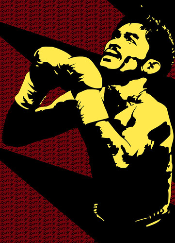
Burnt Fists!
New poster concept for another boxing event. The guy said "Boxing in Burbank". I told him that's too vague. I gave it a new title; he likes it.

Shoutout to the homie (and future middleweight champ) Ian Mauleon for modeling! And thanks for letting me light your gloves on fire while you hold it in place! ^o^

Shoutout to the homie (and future middleweight champ) Ian Mauleon for modeling! And thanks for letting me light your gloves on fire while you hold it in place! ^o^
Thursday, June 12, 2008
Transcending Humanity...
To make sense of this, first become aquainted by these tidbits of trivia:
Arthur C. Clarke's three "laws" of prediction:
1. When a distinguished but elderly scientist states that something is possible, he is almost certainly right. When he states that something is impossible, he is very probably wrong.
2. The only way of discovering the limits of the possible is to venture a little way past them into the impossible.
3. Any sufficiently advanced technology is indistinguishable from magic.
and
Ignostic: the view that a coherent definition of God must be put forward before the question of the existence of God can be meaningfully discussed. If the chosen definition isn't coherent, the ignostic holds the noncognitivist view that the existence of God is meaningless or empirically untestable. A.J. Ayer, Theodore Drange, and other philosophers see both atheism and agnosticism as incompatible with ignosticism on the grounds that atheism and agnosticism accept "God exists" as a meaningful proposition which can be argued for or against.
==============================
Now to bring it all together:
Based on Clarke's third law, there is the idea that a higher-being and a deity are indistinguishable. Perfect example: Jellyfish are very basic life forms; they swim and eat, and nothing else. They have no brains, no eyes, no ears, no nose, and no tongues. Thus, they can not see, hear, smell nor taste, all of which we humans, a higher life form, can do. If jellyfish COULD think, then all these extra senses that we possess would NEVER be fathomable by their minds, because such senses, to them, can not exist in their reality. In fact, anything beyond them and their logical thinking would be nothing short of magic. Can you imagine describing sight to the blind? Audio to the deaf? And as for trying to explain the internet to a jellyfish... forget about it!
So what about a life form higher than humans? Us humans, the all selfish species? We try to explain everything within our own means of reality, yet for all we know, we're just a blind jellyfish floating in the cosmic ocean. If there is a "god", then is god a deity of powers and infinite complexity, or is god just a higher life form? And if infinite expansion theory still plays a role, then is our god but a jellyfish to another life form higher than it?
What do you label something that transcends humanity?
Thursday, May 29, 2008
Yall a bunch of BITERS! *

*quote from Beat Street
So after designing the Espada Boxing company logo, I thought that the owner needed some new business cards rockin em. I was thinking; classy, bold, eloquent, simple, direct, professional. After several design exchanges with the man, he finally came to really like my black-dotted concept:


So as the story goes, the girl he usually goes to for graphics was taken back by it; she was apparently upset to find out that I was chosen to design the company logo, the updated event poster, and now the business card. But c'mon... I don't wanna hate, and beauty is in the eye of the beholder, but I could shit better designs than her standard-photoshop-filtering ass.
One night, before the boxing show, the man picks up his business cards. He calls homegirl up and asks if they were printed; she confirmed that the business cards he sent in (my design) were printed and are to be picked up at Kinkos. He goes to Kinko's and is greeted with these:


Please believe, they look worse if I had a better picture of them. Basically, SHE RAPED MY DESIGN. She bit my front layout, but then added all these asinine ONE-CLICK filters all over MY LOGO, and added some bull shit in the background. The back is just TERRIBLE, and THERE IS NO SUBJECT, just INFORMATION. Her shit looks like a 16 year old was trying to design a club flyer! FUCK THAT SHIT! And I thought, "Oh, maybe the girl isn't too experienced with design. How old is she?" She is... 30 (ish). AT THAT AGE I would fucking EXPECT some kind of LOGICAL REASONING in design! GOD FUCKING DAMN IT!
And though I feel quite violated, and my guy that I designed the biz card for is quite discontent with the printed product, he did get it for... free.
Oh well.
Keep bitin', bitches... Imma still do my thang like this lil guy:

Friday, May 16, 2008
No history, no self...
...know history, know self. ~Pnoy/Pnay Apparel
There is a problem facing those seeking self-realization and social/political change. It is very important to know your history; the history of your family, yourself, your community, society, government, country, or whatever history is the subject of what you wish to see change in. Otherwise, you might end up repeating bad choices and mistakes from the past.
However, memories can change personal history. Bad gossip can change a family's history. Bias can change the history of a community, and political agendas can change the history of society, government, and countries. So the big question is, how do you know the choices you make are not a simple result of somebody's previous experimentation? A recent poll done by Cambridge University showed that 80% of Americans think that their country is heading in the wrong direction, as opposed to 20 years ago when less than 60% thought so. What if some powerful figures are working behind the curtain to MAKE us think such thoughts? This way, the people will CRY, they will BEG for change (because after all, change = hope, right?), and then the men behind the curtain can send their puppet to play to the crowd...
One issue of influence at hand here is the media. Because of the utilization of technology to spread information across the globe instantly, suddenly every minute detail of any tragedy is heard of. This was clearly exampled by the recent earthquake in China; here we are, thousands of miles away, hearing about a massive tragedy that JUST happened. When 9/11 occurred, people in India read about it in their morning news paper. When Katrina happened, students from universities around the world were having fund raisers to help out within a week. We hear about bombings, suicide missions, natural disasters, and all this is compounded by the hype of TERROR, and apocalyptic prophecy; what you are given is a resulting tension in the air, are the current social climate as the product of such.
But I bet you didn't realize that the world is at an all time LOW for global violence since the 1950's...
It hurts my head to CONSTANTLY wonder the agendas behind every commercial, every television show, every movie, every radio song, every bit of periodical literature I come across... I can't decide or trust if I am observing a genuine opinion/fact, or if it's just another bit of influence from "them" to make me think a certain way... I grow weary and tired of the distrust, but at the same time, I feel it necessary to keep an open and cautious mind.
Moral of the story: Don't read in too deep into the things you hear, see, or read. Then again, same thing can be said about this post.
Be free, think free.
~cyph
Friday, May 9, 2008
I ain't shittin on nobody's efforts but...


Sunday, April 27, 2008
Tuesday, April 8, 2008

Saturday, April 5, 2008
Eventualities...
Tuesday, April 1, 2008
Thursday, March 27, 2008
(another) sign of the times...
Greetings, via my new cellphone! A technological do-all, portable, atrophy-inducing piece of monstrosity! Ah, technology, how bittersweet it is...
On the way home from buying our new cell phones, I ask my mom, 'Back in the 70s, when casette players were first starting to come out, did you ever wonder what wonderful technologies that the next generation will enjoy?'
She replied: 'No.'
It doesn't surprise me that the typical guy to girl ratio in technology and science careers is along the lines of 5 to 1... but then again for us tech heads, gadgets and scientific discoveries has always been our reference points to times of progress...
It makes me wonder...
What do the non-tech dependant people of earth use as signs of their times? I suppose cost of living is universal, but I wonder about those esoteric symbols of other subcultures; like nex gen consoles to gamers, mixed martial arts to traditional martial artists, starting to like 'grown up clothes' for the twixers (early 20somethings), advances in crop growth to farmers...
As my thumbs fatigue from this tiny qwerty keyboard and my eyes strain on this portable, glowing piece of technological distraction, I suppose we must all look around at all times; for you never know what you see now in front of you, will eventually be a sign of the times...
Wednesday, March 26, 2008
Friday, March 14, 2008
Tuesday, March 11, 2008
Spoke too soon...

Friday, March 7, 2008
Espada Boxing
Here's a major project I been working on; the Espada Boxing company logo. A friend of mine is starting his boxing club, and needed a logo that only had two colors (for the sake of price efficiency on screen prints) and, most importantly (to him), had gothic font text. Personally, I (as well as many others) think that gothic text is played out, but whatever.
Before the text however, I needed to come up with a logo. I'll edit this post later with my original sketches... but it basically came down to a sword, which "espada" translates to in English, and some boxing gloves hanging off the hilt. Here was my first proposed design for the main logo, which he ended up liking and was kept throughout the other renditions

Despite my best persuasions against it, the man insisted to keep Gothic letters. This was the first version, arcing an all-capped Espada Boxing, forming a circle...

I later came up with the idea to add a shield, since just the sword seemed a bit empty. Needed something to take up space. Also, the sword can represent precision of attack, and the shield for defense; two things to live and die by in the boxing/combat world...

But I thought it would look more full if the letters followed the edge of the shield; he liked the idea, but thought it was hard to read because of the angle of the text. This is still one of my favorite versions:

Later he would go on to criticize the size of the shield, it's proportions etc... So, I messed with the shield proportions, and I came upon this idea, based on the Hellsing patch from the anime. I also took the liberty of using script text, despite the guy's love for Gothic text. This is my favorite of the rejected versions; I was pretty upset when he said he didn't like it:

Also on the list of critiques, he said the Gothic font I used was too complex. So, after messing with the shield's proportions (again) and fonts, I came out with this:

Then he goes on to tell me "Just put the text in the middle..." Ok... Text in front of sword, text in front of shield and behind sword versions:


But I wanted to bring back the edge-following text. I hoped that if I just made the text upright, he'd like it... foolish me:

Still no approval. I was going nuts. He started showing me these simple-ass boxing icons, like Grant, Everlast, and Reyes... All my life I've detested designers who would use simple, stock text and call that a "design"... even more as a "logo". Aside from the use of straight letters, another thing these logos had in common was that they're all contained in a square or a rectangle... as a last ditch effort I came out with this...
 Even though I knew he 100% assured me he wanted Gothic text, I didn't think it looked right. And since he looked up to these other brands, I thought it only right to use straight letters in this final rendition of the logo:

Finally... after a week of designs and getting ideas that I thought looked good, shot down, he finally liked THIS one. Liked it so much in fact that he didn't even wait for me to give him the final logo files without the watermarks. He sent this exact version straight to the press! Hahahaha... awesome. Bathala Project x Espada Boxing; taking the world over from the west coast and on..
Coming soon... the Malakas hat...
Before the text however, I needed to come up with a logo. I'll edit this post later with my original sketches... but it basically came down to a sword, which "espada" translates to in English, and some boxing gloves hanging off the hilt. Here was my first proposed design for the main logo, which he ended up liking and was kept throughout the other renditions

Despite my best persuasions against it, the man insisted to keep Gothic letters. This was the first version, arcing an all-capped Espada Boxing, forming a circle...

I later came up with the idea to add a shield, since just the sword seemed a bit empty. Needed something to take up space. Also, the sword can represent precision of attack, and the shield for defense; two things to live and die by in the boxing/combat world...

But I thought it would look more full if the letters followed the edge of the shield; he liked the idea, but thought it was hard to read because of the angle of the text. This is still one of my favorite versions:

Later he would go on to criticize the size of the shield, it's proportions etc... So, I messed with the shield proportions, and I came upon this idea, based on the Hellsing patch from the anime. I also took the liberty of using script text, despite the guy's love for Gothic text. This is my favorite of the rejected versions; I was pretty upset when he said he didn't like it:

Also on the list of critiques, he said the Gothic font I used was too complex. So, after messing with the shield's proportions (again) and fonts, I came out with this:

Then he goes on to tell me "Just put the text in the middle..." Ok... Text in front of sword, text in front of shield and behind sword versions:


But I wanted to bring back the edge-following text. I hoped that if I just made the text upright, he'd like it... foolish me:

Still no approval. I was going nuts. He started showing me these simple-ass boxing icons, like Grant, Everlast, and Reyes... All my life I've detested designers who would use simple, stock text and call that a "design"... even more as a "logo". Aside from the use of straight letters, another thing these logos had in common was that they're all contained in a square or a rectangle... as a last ditch effort I came out with this...
 Even though I knew he 100% assured me he wanted Gothic text, I didn't think it looked right. And since he looked up to these other brands, I thought it only right to use straight letters in this final rendition of the logo:
Finally... after a week of designs and getting ideas that I thought looked good, shot down, he finally liked THIS one. Liked it so much in fact that he didn't even wait for me to give him the final logo files without the watermarks. He sent this exact version straight to the press! Hahahaha... awesome. Bathala Project x Espada Boxing; taking the world over from the west coast and on..
Coming soon... the Malakas hat...
Subscribe to:
Posts (Atom)