Happy Martin Luther King Jr. day! A year or two back, the illest hiphop vlogger on the planet, JSmooththe Illdoctrine, chimed in on a couple of MLK's knowledge droppings. Check:
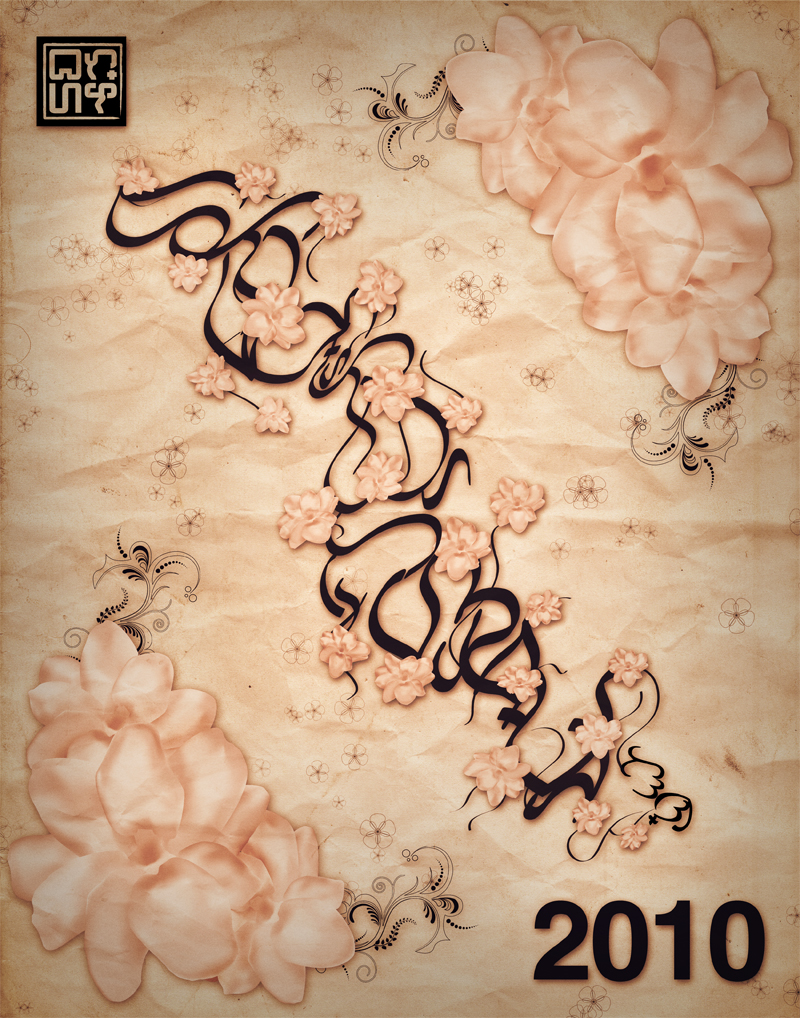
A late Translation Tuesday due to Youtube hating on a brotha... but anyways, happy new year! In this week's special first-of-the-year episode, I bring to you another translation and art-making episode! Today we translate "2010", which in Tagalog reads, "Dalawang Libo't Sampu"; the word "Taon" (Years) is added after to denote years. The reason why 2010 gets translated is because Christian Cabuay, who runs many of the google-popular Baybayin websites, opened the first Baybayin online art gallery, featuring many of your favorite Baybayin artists that you know and love:
As you can see from the flyer, the theme for the very first online gallery is "2010"; how one interprets 2010, and what one expects of it. So, taking a step back from design-communication, I thought I'd take a crack at fine art interpretation...
Essentially, I've experienced a rapid growth of the Baybayin community within the last year; Baybayin writers coming together, acknowledging each other, collaborating, and the word is spreading quickly. Sure, it's still (for lack of a better term) "underground" for now, but we're quickly expanding. I think that in this new decade, the Baybayin community will only grow faster, and essentially begin to blossom:
The Baybayin characters, which spell out "2010" (Dalawang Libo't Sampu) are spread out like roots and vines; extensions are drawn out of them, like leaves and branches extending and reaching out. I illustrated Sampaguita flowers (the national flower of the Philippines) to express my idea of the Baybayin community "blossoming" all about. Also, I wanted this printed piece to resemble a vintage print poster. I'm thinking, a Victorian-era retro Asian poster print. The reason why is because I always thought of Baybayin art as immediately becoming anachronistic once someone brings it into any time frame context outside of it's own, since it is an ancient writing system. Asia has been of the early adapters of poster printing, and I wanted to resonate that look in it's modern-day message; a play on the times, a decade's blossom.
Stay up,
Cyph
P.S. As seen in the end of the video, this piece was made for print. 11x14 prints WILL BE AVAILABLE only at the upcoming Baybayin Art gallery exhibition in February...
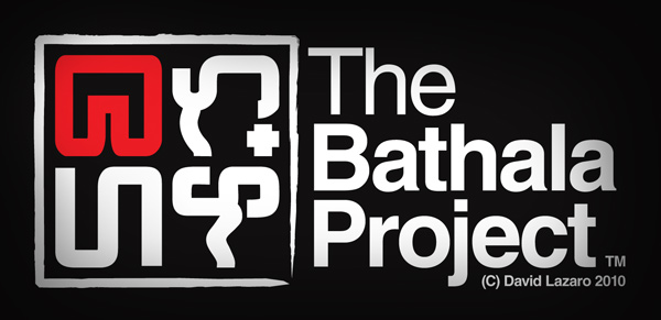
Late last year I redesigned my logo to the circular-form:
The idea was to resonate a familiar geometry, the circle, to complement the mostly-unfamiliar Baybayin script. However, as I further self-criticized the logo, I came up with the following faults:
1. The circular form heavily distorts the characters 2. The line weights weren't heavy enough to compliment a more even negative-space to line ratio 3. The counter spacing was rather uneven in contrast to each character 4. Because of the above reasons, at very small scale, too much detail gets lost
So, addressing these issues, I switched up the geometry to a square, which doesn't distort the characters as much, and evened out both line weight and counter spacing. Aaaand voila:
The idea was taken from ancient Chinese seal stamps, which were usually fashioned in square/rectangular forms, since the characters themselves are rather blocky within their confines. The border line pays tribute to this, resembling an inked line. The characters themselves are monoweight and rounded to emphasize modernity within its approach. Even at small scale, the characters are still distinguishable (to me at least):
And there ya go. Any comments and constructive critiques are very much welcome.
Baybayin (aka Alibata) is an ancient script used by the native Filipinos, pre-dating Spanish Colonization. The Bathala Project utilizes this bold rhetoric in its artwork in an effort to proliferate the cultural knowledge and significance of this dead script... Among other things.