

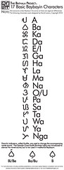
The idea was to resonate a familiar geometry, the circle, to complement the mostly-unfamiliar Baybayin script. However, as I further self-criticized the logo, I came up with the following faults:
1. The circular form heavily distorts the characters
2. The line weights weren't heavy enough to compliment a more even negative-space to line ratio
3. The counter spacing was rather uneven in contrast to each character
4. Because of the above reasons, at very small scale, too much detail gets lost
So, addressing these issues, I switched up the geometry to a square, which doesn't distort the characters as much, and evened out both line weight and counter spacing. Aaaand voila:
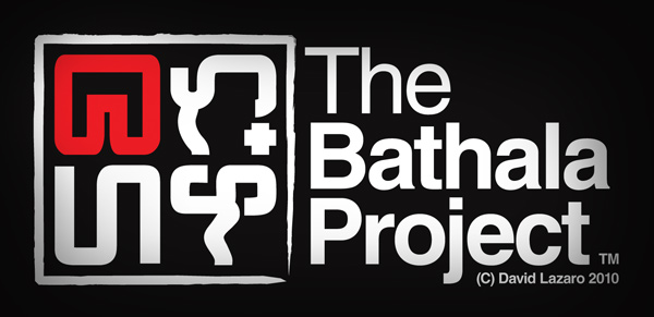
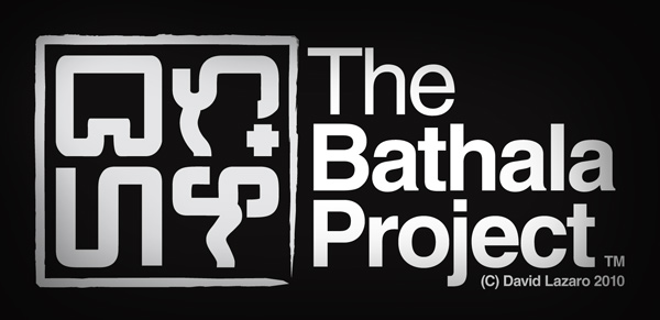
The idea was taken from ancient Chinese seal stamps, which were usually fashioned in square/rectangular forms, since the characters themselves are rather blocky within their confines. The border line pays tribute to this, resembling an inked line. The characters themselves are monoweight and rounded to emphasize modernity within its approach. Even at small scale, the characters are still distinguishable (to me at least):
And there ya go. Any comments and constructive critiques are very much welcome.
edit: Version 2.1
Stay up,
~cyph
1 comment:
Nice stuff there
Happy new year btw
anyways i wanted you check this picture i made in photoshop and it has baybayin on it can you check if i wrote it right i just need second opinion~
http://ephemeralsparkphoto.webs.com/apps/photos/photo?photoid=64983066
thanks
jomar padilla
Post a Comment