
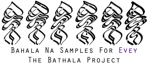
Which later got refined to this:
And, out of laziness to script something of my own, made it into this:
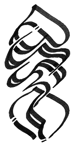
It might be pretty and all, but as a logo, it fails at several things:
- It's too detailed, such that at very small scale, the detail is lost.
- For an artist that openly uses the cross-kudlit, writing "Bahala" instead of "Bathala" is rather inconsistent of myself.
- Because Baybayin is generally not a recognizable shape, if presented on a piece of paper, the viewer may not know which way is right side up

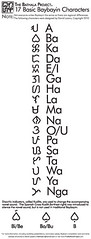
Mono-weight line to match the accompanying monoweight text (Helvetica and Gotham), simple "two color" contrast, recognizable circle geometry, and an overall modern aesthetic to communicate what it is I do with Baybayin; ancient script with modern styling.
Word.
~cyph
1 comment:
Still feelin' the old one. Maybe gotta get used to this first. Peace!
Post a Comment