The Bathala Project
Showing posts with label tagalog. Show all posts

Friday, February 6, 2009

Rock Steady

The other night, my cousin went to a salsa club for her birthday. It was my first time dancing salsa... can't wait to try it again!  

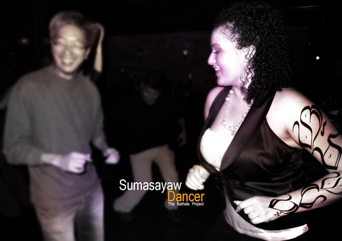
Sumasayaw

Sumasayaw is the Tagalog word for Dancer. So here we have a picture of my cousin's friend, faux-tatted up with the Baybayin characters for Sumasayaw, being accompanied by her witty-footed friend. It was fun to watch!  

Biters fall back, or get your teeth cracked.
~cyph WIC

Share/Save/Bookmark

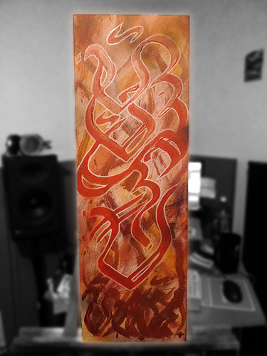
Cecilia

Cecilia

A Baybayin canvas piece for my cousin, Cecilia. Ever since I started "painting", she always suggested that I should be doing canvas pieces. Actually, she was the first person to request a canvas piece from me! And finally, a year later of doing canvases, stickers, hats, cards, tattoo designs, etc... I finally make her a canvas piece. :-D

Better late than never, right?

Her name in red, her last name on the bottom in gold-red. Acrylic, oil paints, aerosol, and deco paint markers on canvas.

Biters will get their teeth cracked, so fall back!

Share/Save/Bookmark

Thursday, February 5, 2009

Focusing

On my way to design a "Bahala Na" tatt for Ms. Evey, I was looking through a few of my books for inspiration; Usugrow's art book, The Calligrapher's Bible, Tssst: Pixacao, Graffiti World...

Finally, I stumbled upon a book I haven't taken a look at in a good while: Word into Art, Artists of the Modern Middle East (By Venetia Porter).  If any of you are into modern calligraphy, specifically Arabic Calligraphy, then this is a MUST pick up!  One thing that really separates the Arabic writing system from others is how much the letters connect and flow.  The simplicity of the stroke design, in effect, births the complexity of its overall aesthetic.  

So, after a few trials, I came out with 6 flowing-scripts for "Bahala Na"

She's looking for a piece to flow down the side of her rib cage/back/side torso.  I think this flows much more than my individual character piece, but I'll give it up for the other one too because the individual charater piece is dope in that superimposed upon the Bahala Na characters are also the charaters for her name...

Anyways, I hope she enjoys the designs, and to the rest that have inquired about tatt pieces, this is just a glimpse of the work process.

Quality over quanity, FREEHAND over FONTS.

~cyph WIC

Share/Save/Bookmark

Tuesday, January 20, 2009

Splatter

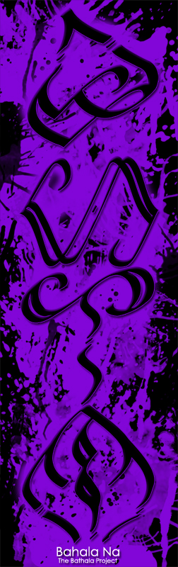
Bahala Na...

Bahala Na Splatter

Negative space has always intrigued me. Like using white calligraphy against black paper, something about the inversion of the expected seems attractive and alluring... like unwrapping a present; each tear is a glimpse of the total package, while at the same time each tear is revealing less of the wrapping paper.

Bahala Na, written in my original hand style. The letters themselves is for a little English girl's tattoo that I'll soon prep the letters better for presentation. BaHaLa Na, which contains 4 Baybayin characters, were designed especially for her such that each character is designed with another character within for each syllable of her name... More on this later.

"Killin yall on this Baybayin shit, mayonaise colored benz, I push Mircale Whips..."
Share/Save/Bookmark

Friday, January 9, 2009

"Mahal"

In Tagalog (the main dialect of the Philippines), the word for "love" and "expensive" are the same word: "mahal"


Stock photos taken from Stock.xchng and some porno... I think it's called "Ass Love 3" or something...
Share/Save/Bookmark

Wednesday, January 16, 2008

Off the top

Another Alibata hat for my friend, Gyn.

Her name, pronounced as "Jin", or "Gin" for you beverage fanatics/alcoholics, is phonetically represented as "Dien", as there is no "J" in the Tagalog language. So, if your "American name" is Johnny, then your Filipino name would probably have been along the lines of Dionny or Dionisio...

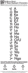
Dien is phonetically represented by the Di, E, and N glyphs as shown:


So, in my own handstyle, I wrote it out, and then emulated and proliferated (and emancipated, oh my!) it into full characters:


Click for full details. Notice the handstyled characters in bold black ink. Also notice the random characters I was sketching. ^_^

I thought the design would look fly if I put it on the side... and it would have been perfect had I been painting on a fitted hat. However, it was a stretch fit cap, and as I soon came to find out, primer solidifies fabric and thus preventing any stretchability of said stretch fabric. Oh well; it'll be a snug fit. However, it still came out nicely I think. Definitely more legible (well, that is if you read Alibata) than the Nas hat. A compromise between style and comfort I suppose...


Momma thought it looked nice, so she decided to model it for me.


More details

Primer on cotton stretch fit cap. Decco paint markers used for the design. Main fill in of characters is silver, accented by red, outlined in black. Yellow outlined the characters. The hat itself is black, with streaks of white resembling sun rays coming from the characters. It draws attention to the design, pointing it as the subject of the piece. The colors are as bright as can be; the shine of the silver and the imposing brightness of the accents made it really pop methinks...

She received the hat in the mail the other week; said it was fly, but said nothing of fit. I guess it'll be a conversational, decorative piece that would lay about her apartment. Heh...

2 of 3
Share/Save/Bookmark

Thursday, January 10, 2008

Alibata - Breaking it Down, Flaring it Out

Alibata, the ancient writing system of the Philippines, has become quite the subject of study and experimentation in recent years. The Alibata system utilizes glyph characters which are derrived from specific parts of the language. One particular example is the word for "god", or "Bathala" (the supreme being, all that is I, etc) in Tagalog.

Bathala may be represented in two phonetic forms:

"Ba-ta-la"
or
"Ba-ha-la"

Although today, "bahala" has become commonplace in the modern Pilipino language in such coliquial phrases as "bahala na", literally meaning "god to you", or in a more connotative sense, "god watch over you" in times of preoccupation.

Now for a more in depth look, as examined by Perla Ramos Paredes Daly in her essay, "Bathala Mediations":


BA

In the shape of ba are the organic feminine forms---breasts, buttocks, vagina, or uterus... and thus the energy/spirit/diwa of the feminine principal, which in Filipino can be expressed as Maganda. Feminine principle qualities/energies are, to name only some, nurturing, sensuality, beauty, spirituality, fertility, compassion, receptiveness and submission to Divine will.


LA

In the shape of la is the organic form of the male sexual organs, that is, the testicles and the penis. "La" conveys the energy/spirit/diwa of the masculine principal, which in Filipino can be expressed as Malakas... Masculine principle qualities/energies are, to name only some, action, dynamism, force, strength, fertilization, challenge, aggression, domination, challenging.


HA

In the curves of the ha baybayin symbol there is the principle and meaning of: air... breath... spirit... and light. You might be able to see what I see in the baybayin of "ha" ---similarities to scientific graphic renderings of light waves... ... you can also definitely see and feel in the shape of "ha" forms of wind and air... Equipped with this new knowledge from unlocking the secrets of baybayin and the meanings in BAHALA, I came to an awareness that for the early Filipinos, Bahala encompassed both Feminine and Masculine energies of the Universe. It was conveyed by the feminine and masculine baybayin symbols and sounds in it---"ba" and "la" --- and most importantly connected in the middle with the "ha" sound symbol.

-Daly, Bahala Mediation pg.3-4

With such meaning behind each character, it's form is analogous to that of the early Chinese glyphs which often visually resembled the words they expressed.

In my take of Alibata, inspired by my experiences with calligraphy, graffiti, and hand style, I'm trying to proliferate into a word art of the writing system. For Christmas, I made a few of my friends some hats, with their name phonetically translated into Alibata, stylized through my vision of what it could be. This would prove as a sample test to experiment on my ideas and to see what I can accomplish...

For my friend Nasser:
"Nasser" is actually four characters long, but for the sake of simplicity and "real-estate" on the hat, I decided to use just his nick name, "Nas." The phonetic translation of this is:


Na S

As with graffiti, what makes a writer's name stand out is their style. Stylizing your letters shows much about one's character and influences. Los Angeles writers typically have sharp letter styles, East Coast have more bubbly-letters, and Philadelphia writers are prone to wild styles. Most artists that use Alibata typically keep the glyphs in their traditional form to ensure that the writing system is being utilized.

However, if the writing system is already a "dead script", then why bother being so formal about the characters? Why not heavily stylize them? It's already being done to some extent with calligraphy and jewelry, but still... it could keep growing.

As seen in this picture of my sketch book is my take on the "NaS" characters that would later go on the hat. On the top right you could see the traditional letter style, then my handstyled version.


After some primer and paint and mess ups and frustration and beers and procrastination and inspiration came out the end result:


If you're new to graffiti, understand that the bubble-background is nothing new hahaha...

In any event, I like how it came out; though it's much more clear on paper and the lines are much more defined, it still came out decently. Also, the glyphs take a very light-hearted look, with bright colors that I felt would reflect a cool yet fun mood. The hat is a stretch-fit cap of cotton, the front has been sprayed by white primer. Decco paint markers were used to color the design. Tip: Don't use the metal fine-tip Decco's; they'll clog up as soon as they touch primered fabric.

1 of 3

Share/Save/Bookmark