Well, I think I'm starting to hone in as to what my next series is going to be: Baybayin Ads. Much like Nordenx's take on Pepsi and Coke ads, I'm looking to use Baybayin in pseudo magazine-ads that not only use Baybayin, but also have stylized character forms to communicate a graphic resonance as well... The more I'm getting into typography, the more the possibilities of using Baybayin in these types of concepts grow... Now if only I had the patience to generate all of these Baybayin "typefaces" at a whim!
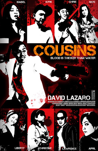
Anyways, here's a quick non-Baybayin piece I did up for a movie-poster study. The font used is called "Capture it", and this is a study on using cropping and multiple photos to develop a single composition. I used the Smokin' Aces movie poster as a basic template, and tried to give a Guy Ritchie feel to it... It works... kinda.
Like Roscoe Umali said, "I'm Filipino, I roll deep with 50 cousins." There were too many of them to fit in this piece!
Stay up!
~cyph


No comments:
Post a Comment