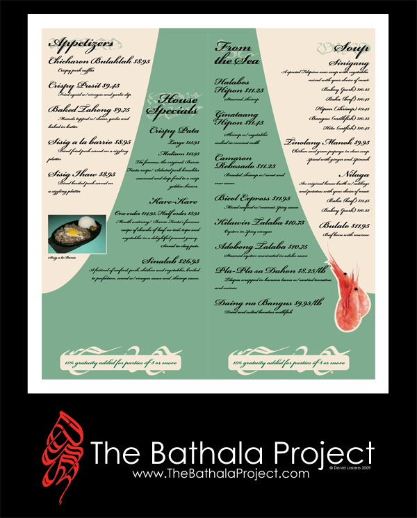
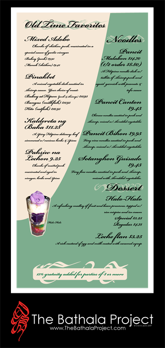
Only half the food items were listed, but even then, I never realized how often vinegar was used in Filipino dishes until I started reading every menu item description. It's as if Filipinos would starve if it wasn't for vinegar and meat...

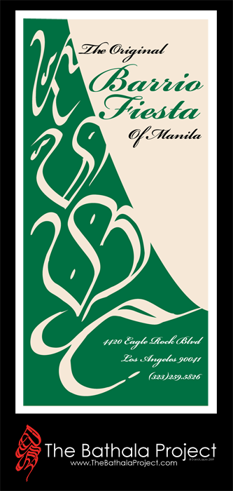
Baybayin is subtly used as part of the title treatments for the food item categories, replacing the use of typical glyphs. The menu was designed, concentrating on the use of spacing and text treatment to give the menu a more modernized aesthetic.
I didn't want to clutter the menu with too many pictures of foods, but as my mother explained to me, it's typical to see many pictures of Filipino dishes on menus simply because of the regional differences of every dish; by seeing a picture of the dish, the person could get a better understanding of how it's prepared. For example, some people prefer their adobo dry, others like it soupy. However, I didn't want the pictures to take away from the simple elegance of the curves and the shapes of both the Baybayin glyphs, the text curvatures, and the menu backgrounds that I was trying to bring forth. After all, crispy pata isn't the prettiest thing in the world... but it sure tastes damn good.
Free Swag Thursday in full effect tomorrow!
Stay up,
~cyph


No comments:
Post a Comment